1
Problem: visitors leave anonymous
The Church Health Check
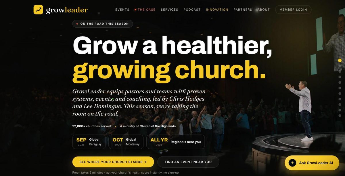
A short, interactive diagnostic. A pastor answers a few questions and instantly sees where their church is strong and where it's stuck. That's the exact moment GrowLeader becomes relevant to them.
Outcome: every serious visitor self-identifies as a warm lead, and tells us what they need before a single call.
2
Problem: follow-up needs a human
Automated fulfillment
The second someone finishes the Health Check, the system delivers their report on screen, downloads a copy, and emails it, with the results and their weakest area attached for the team.
Outcome: no extra manpower. It runs itself, day or night, whether or not anyone is watching.
3
Problem: no way to help at scale
The AI leadership coach
A pastor can ask a real question, like "how do I build a volunteer pipeline?", and get a thoughtful answer trained on GrowLeader's philosophy, any hour of the day.
Outcome: GrowLeader's wisdom, available 24/7, turning curiosity into engagement instead of a bounce.
4
Problem: flying blind
Real tracking
Every meaningful action is measured: a Health Check finished, a coach opened, a CTA clicked. For the first time, the team can see what's actually working.
Outcome: decisions based on data, not guesses, and a foundation to build a team dashboard on later.